Decorative medieval serif font for display and thematic projects
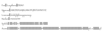
Longa Iberica, from Paweł Burgiel, is a decorative serif typeface that evokes Visigothic and Proto-Gothic calligraphy for historical and fantasy design work. The font renders elongated vertical strokes and sharp serifs for display use, and offers OpenType features alongside historical alternates for typographic variation. It includes old-style numerals, fractions, and a wide European character set, and uses a 'flat' kerning table to improve compatibility with older layout software.
What does Longa change about display typography?
The font emphasizes a tall, calligraphic voice through long ascenders and descenders and a small x-height, traits drawn from medieval scripts. This profile makes Longa most effective at larger sizes, where the elongated vertical strokes and sharp serifs remain legible. Designers should treat it as a display face for headings, covers, or signage rather than as a primary text face for dense body copy.
How much typographic control does the designer get?
Longa exposes several typographic alternates and historical letterforms to refine headings and decorative lines. OpenType features and glyph variants enable substitution of ligatures, stylistic alternates, and fraction forms. Use the alternate characters to produce period-accurate word shapes, and enable lining or old-style figures depending on whether numerals need to match surrounding text tone.
Does it support multiple languages and formats?
The typeface ships as a TrueType (.ttf) file, so it installs on Windows and on desktop systems that accept standard font files. Character coverage lists several Latin encodings (Western, Central, Turkish, Baltic), which covers most European language needs cited for the design. That encoding scope helps when setting multilingual titles or packaging assets for European releases.
How does it behave with legacy layout tools and in production?
Longa includes a 'flat' kerning table intended to reduce kerning conflicts in older applications that misapply pair adjustments. The font's historical glyph set and display profile suit book covers, game UI headings, and thematic branding. Popularity in niche communities, evidenced by large download figures on public font sites, indicates active use among designers who target historical aesthetics.
Longa is a specialist display face for historical and fantasy work
Longa is a clear choice for designers who need an authentic medieval look for headings, covers, and game UI elements, especially when multilingual support matters. Practical tip: reserve Longa for display sizes and pair it with a neutral text face for readability; note that the demo is for personal testing, while commercial deployment requires a license from authorized distributors.